Member-only story
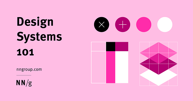
The 60–30–10 rule of colour
Published in
3 min readNov 5, 2024
The 60–30–10 rule is a foundational guideline in design, particularly in color theory, that helps achieve visually pleasing and harmonious color schemes. It originated in interior design but has become popular across various fields, including web and UI design.
By dividing colours into three proportions (60%, 30%, and 10%), this rule guides designers to create balanced compositions that are both functional and aesthetically compelling.
Colour has power which directly influences the soul.
What is the 60–30–10 Rule?
The 60–30–10 rule is all about balance and dominance in a color palette:
- 60% (Primary Color) — This is the dominant colour and covers the largest area. It’s usually the background or main color and sets the overall tone of the design.
- 30% (Secondary Color) — The secondary color complements the primary, creating a sense of contrast and visual interest. It’s used on elements like backgrounds, buttons, or other areas that support the main color.
- 10% (Accent Color) — This is the highlight color that adds personality and brings attention to key elements. It’s often applied to elements like call-to-action buttons, icons, or links.


